What the hell happened to Backloggery?
-
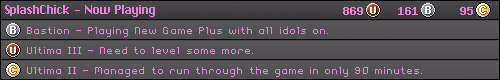
SplashChick

- 64-bit
- Posts: 365
- Joined: Sat Dec 12, 2009 2:33 am
- Contact:
Re: What the hell happened to Backloggery?
It seems to show like a hundred anyways. Are you really that lazy that you can't click a button and wait half a second for the rest to be added?

Re: What the hell happened to Backloggery?
It shows 50 at a time, and they made the game boxes have less going on in them compared to the old site. The old design was functional and was visually appearing. I can understand changing things under the hood and enhancements like the quick mode/detailed mode. But some of it feels like a step backwards.
Blizzard Entertainment Software Developer - All comments and views are my own and not representative of the company.

Re: What the hell happened to Backloggery?
OH YES, THAT'S IT! I'm too lazy! Clicking through more pages isn't cumbersome at all if you're a hard worker with a can-do attitude!SplashChick wrote:It seems to show like a hundred anyways. Are you really that lazy that you can't click a button and wait half a second for the rest to be added?
My contributions to the Racketboy site:
Browser Games ... Free PC Games ... Mixtapes ... Doujin Games ... SotC Poetry
Browser Games ... Free PC Games ... Mixtapes ... Doujin Games ... SotC Poetry
Re: What the hell happened to Backloggery?
Are you claiming you AREN'T a stupid lazy toad?J T wrote:OH YES, THAT'S IT! I'm too lazy! Clicking through more pages isn't cumbersome at all if you're a hard worker with a can-do attitude!SplashChick wrote:It seems to show like a hundred anyways. Are you really that lazy that you can't click a button and wait half a second for the rest to be added?In fact, why not just display 10 games at a time... or 5.. or maybe even just one. That would be great! This isn't a discussion about optimized web design, it's all a matter of how LAZY JT is. That stupid lazy toad. Shame on him and his slothful ways!
Blizzard Entertainment Software Developer - All comments and views are my own and not representative of the company.
Re: What the hell happened to Backloggery?
I'm not even sure anymore and I can't be bothered to put in enough effort to care.MrPopo wrote:Are you claiming you AREN'T a stupid lazy toad?
My contributions to the Racketboy site:
Browser Games ... Free PC Games ... Mixtapes ... Doujin Games ... SotC Poetry
Browser Games ... Free PC Games ... Mixtapes ... Doujin Games ... SotC Poetry
-
FiftyDollarCurse

- 128-bit
- Posts: 577
- Joined: Thu Aug 13, 2009 6:36 pm
- Location: Utah
Re: What the hell happened to Backloggery?
I think it looks fine, but we shouldn't pretend that the "old version" wasn't just as ugly. Aesthetic pleasure has never been the backloggery's strength.
I would rather have to expand the games list when I want to look at it than not be able to look at it at all because their server is overloaded.
I would rather have to expand the games list when I want to look at it than not be able to look at it at all because their server is overloaded.

Re: What the hell happened to Backloggery?
From an aesthetic point of view, I dislike some of the changes. The move to simple buttons denoting which console is in my collection is a bit irksome, as I enjoyed the controller images and actually used them to quickly navigate the list. I suppose I wouldn't mind so much if the list was in alphabetical order, but it doesn't seem to really be in any order at all. If they changed that to save time loading images, why did they add them to the titles of each box? I also don't care for the large Deals of the Day and Support Us buttons framing all of that small plain text. And yeah, I understand the need, but I enjoyed being able to view my console collection in full.
Now there are a few things I do like. For one, the quick access to the Trends tab is nice, and I like having access to a Pie chart of my game collection, though I wish I could view the graphs for two of the three entries like we could with the old design. Also I think the new bubbles for information are ok. They certainly attract the eye, and my current Dan-based color scheme makes me think of cotton candy and bubblegum when coupled with the new layout. And I do like the new design for the bars totaling my game completion percentages.
I don't really care for the addition of the hourglass on what games I'm playing. I preferred it simply greying out game names after 30 days. It seems unnecessary, and I dislike the off-center placement for the icon, as I tend not to write notes about my progress in games.
Also, why is my Friends list now called my Multitap? And why must the new message icon be situated off in the black space to the left of the screen, where nothing else happens to be? It makes the rest of the page feel like wasted space.

Re: What the hell happened to Backloggery?
Agreed with you on all these points.Ack wrote:Now there are a few things I do like. For one, the quick access to the Trends tab is nice, and I like having access to a Pie chart of my game collection, though I wish I could view the graphs for two of the three entries like we could with the old design. Also I think the new bubbles for information are ok. They certainly attract the eye, and my current Dan-based color scheme makes me think of cotton candy and bubblegum when coupled with the new layout. And I do like the new design for the bars totaling my game completion percentages.
I don't really care for the addition of the hourglass on what games I'm playing. I preferred it simply greying out game names after 30 days. It seems unnecessary, and I dislike the off-center placement for the icon, as I tend not to write notes about my progress in games.
Also, why is my Friends list now called my Multitap? And why must the new message icon be situated off in the black space to the left of the screen, where nothing else happens to be? It makes the rest of the page feel like wasted space.
Especially the hourglass thing, since my list is huge and I'm lazy on updating it (and hardly write notes like you)... the placement of the icon is terrible. Simply putting that at the very left or right would probably look a lot better.
And yeah the Friends List being "Multitap" caught me off guard, awkward.

-
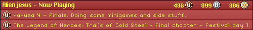
alienjesus

- Next-Gen
- Posts: 8875
- Joined: Tue Feb 24, 2009 7:10 pm
- Location: London, UK.
Re: What the hell happened to Backloggery?
http://backloggery.tumblr.com/
Seems moving the hourglasses and adding better ways to sort through your games are near the top of his to do list!
Seems moving the hourglasses and adding better ways to sort through your games are near the top of his to do list!
Re: What the hell happened to Backloggery?
Good to hear. And bring back those controller icons!