Someone asked about the existence of a racketboy t-shirt, and my friend Adny and I drew up an idea for one. Wondering what you all think.
offer up some comments, things that might help in directing this closer to the "racketboy.com" fell... and if you have any skills you can offer, please do. I'm not offended by criticism... nor hurt by the idea of help. I work on art projects as a team, and teams are where the best work comes from.
Last edited by lordofduct on Fri Nov 02, 2007 3:14 pm, edited 2 times in total.
Though I am not a big fan of yellow, that art is awesome. Has a very casemod/lithograph feel to it, I think it may be a bit intense for a shirt. But dont trust me on anything fashion related that is below blacktie. Even then I probably wouldnt listen.
How about this for darkening the lines around beat.
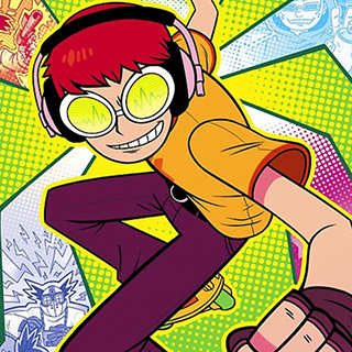
oh and the yellowish green background is a separate layer that can be changed to any colour... we just used that cause it's a common colour in Jet Set Radio and it also brings out the vibrancy of the rest of the picture (especially the blue).
PharmaceuticalCowboy wrote:mmm more cel-shady (that cannot possibly be a word), maybe you should give the letters the same treatment?
I tried it with the letters, it looked ok on the 'retro' lettering on his shirt if I kept the opacity and strength down... on the graffiti it just looked like pooh.
It actually turns out the only reason Adny didn't do it in the first place though was because when it was done it caused a lot of imperfections that I had to go through and erase... and he was feeling lazy at that moment and decided to let me do it on my own.
bum, didn't even tell me to do it, just waited for me to notice.
I'll take a black and a red, name your price.
Oh and a suggestion, maybe make the blue splash a little deeper of a blue, it seems a little intense for my taste.
JT wrote:Yeah, like vampire aliens invade and hit us all with a ray beam that paralyzes all of our arms. The only way to deactivate the ray beam and fight back the vampire alien threat is with a complicated series of foot patterns on the device's control board that looks remarkably like a DDR pad. We will all praise this man for saving our lives and buy him a mountain of stuffed animals.
Constructive Criticism....
It is hard to read. It took me a few seconds to figure it out.
That graffiti idea is cool, but I personally think the big blue slash in the back is unnecessary and/or doesn't quite fit in.
A brick wall or the side of a van would be cooler
racketboy wrote:Constructive Criticism....
It is hard to read. It took me a few seconds to figure it out.
That graffiti idea is cool, but I personally think the big blue slash in the back is unnecessary and/or doesn't quite fit in.
A brick wall or the side of a van would be cooler
I was actually picturing a brickwall in my head as well... but I'm not andy.
For the graffiti, I can change it up in any way as it's a separate layer... I can also add anyone else's graffiti that someone made (that is my big issue, neither Andy or I are very good a drawing graffiti, but we went for it cause I thought it matched Jet Set Radio a lot which is what we are mocking for the racketboy character.
see:
I'll try out some other ideas.
IF anyone can draw really good graffiti, please let me know. We can put them together to make a nicer design!
Last edited by lordofduct on Thu Nov 01, 2007 10:56 pm, edited 1 time in total.