The Nintendo logos are tiny and hardly as hindering to the artwork as Xbox neon green borders and logos all over the place.
That's completely inane and just ignores all the evidence to the contrary (including examples I provided above).
Green borders on Xbox games always surround the art, whereas often on NES games logos are placed over top of it. In fact, on many NES boxes the artwork was shrunk to fit inside the logos (treating them like a border) or otherwise had to risk having the logos plastered over top of the illustration. There's many good and bad examples of the intrusion of logos (or large borders) in both older and newer games, including in NES titles. If you can't see that, you are looking at these through rose-tinted glasses.
You really can't see the uniformity of modern console game cases vs. the NES ones? Like was said earlier, yes there are borders on some NES games, but that was the choice of the publisher. It wasn't enforced on every game, like modern games.
And the little Nintendo logo is hardly the same as the bright neon green borders or blue borders of a PS4 games. It doesn't make a whole row on your shelf look green, it makes that shelf a rainbow of awesome NES boxes.
BurningDoom wrote:
You really can't see the uniformity of modern console game cases vs. the NES ones? Like was said earlier, yes there are borders on some NES games, but that was the choice of the publisher. It wasn't enforced on every game, like modern games.
And the little Nintendo logo is hardly the same as the bright neon green borders or blue borders of a PS4 games. It doesn't make a whole row on your shelf look green, it makes that shelf a rainbow of awesome NES boxes.
complaining about the uniformity of packaging is not the same thing as claiming new games are "hindering the art" by blocking it with logos. You were suggesting that the box art is worse today because of the prevelance of logos (which is the same) and the inclusion of borders (which doesn't block/hinder the art itself).
No, this is what I said:
Man, I love NES boxes. Pure artwork. No stupid color schemes or logos to get in the way. They look like VHS boxes.
No color schemes OR logos to get in the way.
Are you done nitpicking? I like NES boxes more because there's more artwork. There is an obvious difference between the two.
BurningDoom wrote:
Are you done nitpicking? I like NES boxes more because there's more artwork. There is an obvious difference between the two.
I am gonna have to agree. Lots of nitpicking and people having to prove they are right over something as silly as liking NES box art. Why can't we all just get along?!
Ack wrote:I don't know, chief, the haunting feeling of lust I feel whenever I look at your avatar makes me think it's real.
-I am the idiot that likes to have fun and be happy.
BurningDoom wrote:
No color schemes OR logos to get in the way.
The point is that the Seal of Quality and the Nintendo logos are... logos on the NES boxes. They are less intrusive than banners on current packaging and they aren't in exactly the same place on every NES box, but they are still there.
But anyway, this has become a circular argument so we can move on now.
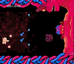
Playing through Metroid Prime again and had a realization this time that I've never had before: Samus doesn't have to go to Tallon IV. The entire game, she's not even on the job - she just answered a distress call.
So with her power suit crippled and knowing she was out gunned, she still deliberately chooses to go down to Tallon IV. She didn't know it was a lost Chozo colony - she had no reason to assume she'd be able to regain her abilities.
Either she was way confident in her ability to deal with the situation with nothing more than a space suit and a gun or she really F'ing hated Space Pirates and any chance to kill them is a good chance.
These are the reasons why I love Samus Aran.
Maybe now Nintendo will acknowledge Metroid has a fanbase?
BurningDoom wrote:
No color schemes OR logos to get in the way.
The point is that the Seal of Quality and the Nintendo logos are... logos on the NES boxes. They are less intrusive than banners on current packaging and they aren't in exactly the same place on every NES box, but they are still there.
But anyway, this has become a circular argument so we can move on now.
Yeah, but he never said they weren't there, but rather that they didn't get in the way. That's where Dave made his mistake.
Flake wrote:Playing through Metroid Prime again and had a realization this time that I've never had before: Samus doesn't have to go to Tallon IV. The entire game, she's not even on the job - she just answered a distress call.
So with her power suit crippled and knowing she was out gunned, she still deliberately chooses to go down to Tallon IV. She didn't know it was a lost Chozo colony - she had no reason to assume she'd be able to regain her abilities.
Either she was way confident in her ability to deal with the situation with nothing more than a space suit and a gun or she really F'ing hated Space Pirates and any chance to kill them is a good chance.
These are the reasons why I love Samus Aran.
I love that game so much. I stayed away from it because it wasn't following the same theme as my precious Metroid and Super Metroid games before it. When I finally did sit down and play it, I was blown away. Just as cool as Super Metroid, in it's own way.
BurningDoom wrote:
No color schemes OR logos to get in the way.
The point is that the Seal of Quality and the Nintendo logos are... logos on the NES boxes. They are less intrusive than banners on current packaging and they aren't in exactly the same place on every NES box, but they are still there.
But anyway, this has become a circular argument so we can move on now.
Yeah, but he never said they weren't there, but rather that they didn't get in the way. That's where Dave made his mistake.
I made no "mistake"
He said that NES boxes have no logos or borders to get in the way of the art. He's wrong, they do. Some of them are just as obnoxious or sparse as those found on games today, but there's no doubt that they are just as "in the way".
It looks like Wii points are very hard to get by, I searched ebay and it seems like there are only 3 listings. For something that sold like 100m units, and is still selling, this is a quick phase out. Either that or I am looking in the wrong places.
btw, do Wii Points share the same store with DS? I found cards that say DS and Wii points