Page 485 of 2240
Re: Random Gaming Thoughts
Posted: Sat Feb 08, 2014 4:59 pm
by dsheinem
BogusMeatFactory wrote:You are right Dave...those logos do get in the way.
They're no less intrusive than the required logos on most recent games. The difference is that on these Nintendo boxes most of the companies kept the artwork smaller and placed the logos around the key art, whereas now the trend is to put some of the logos over the key art (including on PC games) and to also have some kind of border.
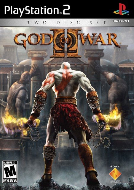
I actually prefer the clean, larger look of something like this:
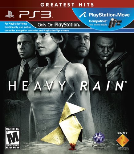
over the art on a lot of those NES boxes. Obviously there are ridiculous examples still today:
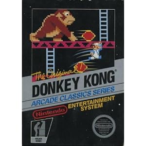
but there were ridiculous examples of over-logoization then too:
Re: Random Gaming Thoughts
Posted: Sat Feb 08, 2014 5:56 pm
by BoneSnapDeez
You wanna talk about logos and text getting in the way of game art?
Nothing beats the old Atarisoft titles.

Re: Random Gaming Thoughts
Posted: Sat Feb 08, 2014 5:57 pm
by BogusMeatFactory
BoneSnapDeez wrote:You wanna talk about logos and text getting in the way of game art?
Nothing beats the old Atarisoft titles.
What game is that?
Re: Random Gaming Thoughts
Posted: Sat Feb 08, 2014 6:07 pm
by BurningDoom
dsheinem wrote:BurningDoom wrote:Man, I love NES boxes. Pure artwork. No stupid color schemes or logos to get in the way.
um
nes.jpg
That little tiny little Nintendo Seal of Quality is just like the neon green uniformity of Xbox titles or similar things.
Re: Random Gaming Thoughts
Posted: Sat Feb 08, 2014 6:20 pm
by SNKnicotine
I'm not much into computer gaming, but I really wish I had played the postal series.

Re: Random Gaming Thoughts
Posted: Sat Feb 08, 2014 8:51 pm
by Hobie-wan
SNKnicotine wrote:I'm not much into computer gaming, but I really wish I had played the postal series.
I tried Postal 2. It wasn't very amusing or fun and wore out its welcome after about 30 minutes.
Re: Random Gaming Thoughts
Posted: Sat Feb 08, 2014 8:57 pm
by dsheinem
BurningDoom wrote:dsheinem wrote:BurningDoom wrote:Man, I love NES boxes. Pure artwork. No stupid color schemes or logos to get in the way.
um
nes.jpg
That little tiny little Nintendo Seal of Quality is just like the neon green uniformity of Xbox titles or similar things.
Not sure I follow.
Re: Random Gaming Thoughts
Posted: Sat Feb 08, 2014 11:27 pm
by BurningDoom
dsheinem wrote:
Not sure I follow.
The Nintendo logos are tiny and hardly as hindering to the artwork as Xbox neon green borders and logos all over the place.
Re: Random Gaming Thoughts
Posted: Sun Feb 09, 2014 9:02 am
by RCBH928
Any one can log on the homebrew channel on Wii?
I am getting something that says error -8 and I am not sure if it is my Wii that has something wrong with it or the servers of the Homebrew channel
Re: Random Gaming Thoughts
Posted: Sun Feb 09, 2014 10:31 am
by dsheinem
BurningDoom wrote:dsheinem wrote:
Not sure I follow.
The Nintendo logos are tiny and hardly as hindering to the artwork as Xbox neon green borders and logos all over the place.
That's completely inane and just ignores all the evidence to the contrary (including examples I provided above).
Green borders on Xbox games always surround the art, whereas often on NES games logos are placed over top of it. In fact, on many NES boxes the artwork was shrunk to fit inside the logos (treating them like a border) or otherwise had to risk having the logos plastered over top of the illustration. There's many good and bad examples of the intrusion of logos (or large borders) in both older and newer games, including in NES titles. If you can't see that, you are looking at these through rose-tinted glasses.