Racketboy T-Shirt
-
gradualmeltdown
- 128-bit
- Posts: 702
- Joined: Thu Apr 26, 2007 3:26 am
- Location: Portland Oregon
I don't like it at all. Not the kind of design I would sport on a shirt. Art isn't too bad, but the graffiti is really poor. Being a graffiti freak I just can't dig it. Not trying to be mean or anything, just honest. I'd really like to wear a Racketboy T!
I like old games
I like new games
I like games
I like new games
I like games
Well, I think even they admit the graffiti is the weakness here. Hopefully that generator will help, and if anybody can share background that would help, post some...gradualmeltdown wrote:I don't like it at all. Not the kind of design I would sport on a shirt. Art isn't too bad, but the graffiti is really poor. Being a graffiti freak I just can't dig it. Not trying to be mean or anything, just honest. I'd really like to wear a Racketboy T!
Support Racketboy on Patreon
Follow Racketboy on Social: Instagram / Twitter / Facebook
Subscribe to Email Newsletter (Blog / Guide Updates Every Week or Two)
Follow Racketboy on Social: Instagram / Twitter / Facebook
Subscribe to Email Newsletter (Blog / Guide Updates Every Week or Two)
-
lordofduct

- Next-Gen
- Posts: 2907
- Joined: Sat Apr 01, 2006 12:57 pm
- Location: West Palm Beach
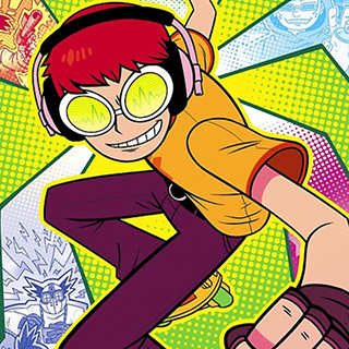
it appears the only complaint is really the graffiti... which I stated already is kinda slapdash to go with the character design.
You must understand, the thread I linked to in the first post I said Adny and I would design a 'character' not a full out design. I put together the graffiti (me the programmer, NOT an artist... that is Adny who draws) and I agree it isn't the greatest... I may have jumped the gun (which I'm notorious for) on letting you think this is a final draft of some sort, or that the graffiti is the heart of it.
The graffiti is NOT the heart of this, and for you graffiti nuts, yeah, it sucks on that level. Please if your a graffiti nut, help me out, neither Adny nor I are big into the tagging scene (of all the art scenes we are associated with) and are ill equipped in that styling. Help out maybe, give me a hand.
As for the generator, I played with it this morning and it really felt out of place next to racketboy. But again, I might just suck.
I then thought up something else from a combination of posts... we should emphasize WHAT the website is about and shit. So I thought the RETRO in graffiti was a good idea. And maybe a little extra, and then below it in normal RacketBoy text say something like "gaming... at Racketboy.com" or something else.
here is a MOCK of what I mean:
Last edited by lordofduct on Fri Nov 02, 2007 3:14 pm, edited 2 times in total.
Send me a layered PSD file and I can play with some stuff.
Support Racketboy on Patreon
Follow Racketboy on Social: Instagram / Twitter / Facebook
Subscribe to Email Newsletter (Blog / Guide Updates Every Week or Two)
Follow Racketboy on Social: Instagram / Twitter / Facebook
Subscribe to Email Newsletter (Blog / Guide Updates Every Week or Two)
-
lordofduct
- Next-Gen
- Posts: 2907
- Joined: Sat Apr 01, 2006 12:57 pm
- Location: West Palm Beach
well, this is more difficult that I thought.... 
The graffiti creator isn't as useful as I was hoping either....
The graffiti creator isn't as useful as I was hoping either....
Support Racketboy on Patreon
Follow Racketboy on Social: Instagram / Twitter / Facebook
Subscribe to Email Newsletter (Blog / Guide Updates Every Week or Two)
Follow Racketboy on Social: Instagram / Twitter / Facebook
Subscribe to Email Newsletter (Blog / Guide Updates Every Week or Two)
-
abeisgreat

- 128-bit
- Posts: 528
- Joined: Fri Jul 27, 2007 1:55 am
- Location: Wisconsin
- Contact: