Droid party wrote: Perhaps for the graphic ,maybe remove the monitor and just have a picture alone. oh and i'll miss the saturn conroller but oh well.
I'm gonna play around with ideas in Photoshop.
I don't want to do "just the screenshot" since I felt that looked a bit generic.
Well, whatever you do I think it's going in the right direction.
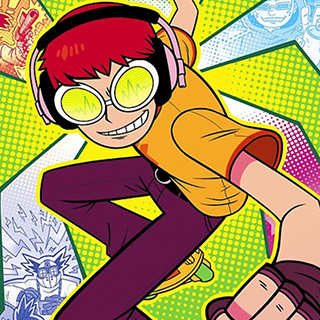
Are you leaning toward Jet grind radio for the art or is that still open.
I only go with JGR because of my avatar and such, but I am open to other stuff.
Like I mentioned before, I want something with a splash of color, but it needs to be clean and not just a box of something. I want it to be an object or objects on a clean white background. If I could find a clean picture of some consoles, controllers, or games together, that might be cool.
Yackom wrote:I like the new content, but I like how I could see the whole page without scrolling down before = My 2cents.
Well, it fits fine on my larger monitor, but yes, there is a small amount of scrolling on smaller displays like my laptop.
I did just tighten up some of the descriptions and the number of bullet items in the middle, so it should be shorter now.
I think when I was looking at it, it was downloading the HTML malformed or it wasn't rendering it correctly at all. I thought that was the case when I first saw it but I hit refresh a few times and didn't change. Now that I look at it this morning it looks great, weird I guess something was off. Looks good now so disregard my earlier statement.