
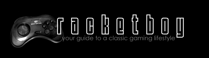
Do you like the new logo?
(it will be smaller in the header)
I wanted something a little more modern, streamlined, and something to tie in the theme of the site.
Once I put it on a mockup of the site, I'm not sure if I like it as much as the original -- especially with the controller on the side.
Update - Check this out:
http://www.racketboy.com/forum/viewtopic.php?p=21177


